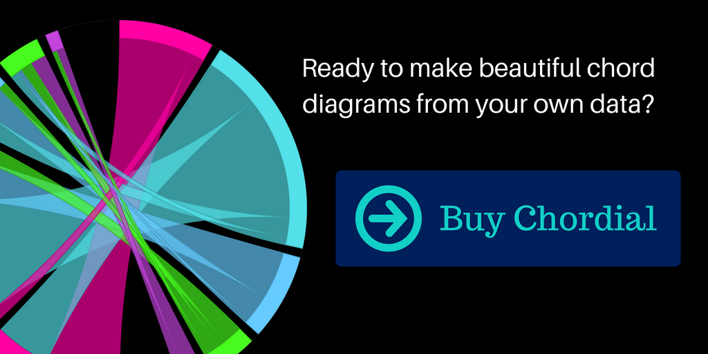
Chordial
Build beautiful chord diagrams with just a few clicks
Time for a quick demo?
Fast, easy, and simple
Plug in a matrix, and you will immediately see a chord diagram of that data. Use the simple point-and-click interface to change colors, labels, and other settings.
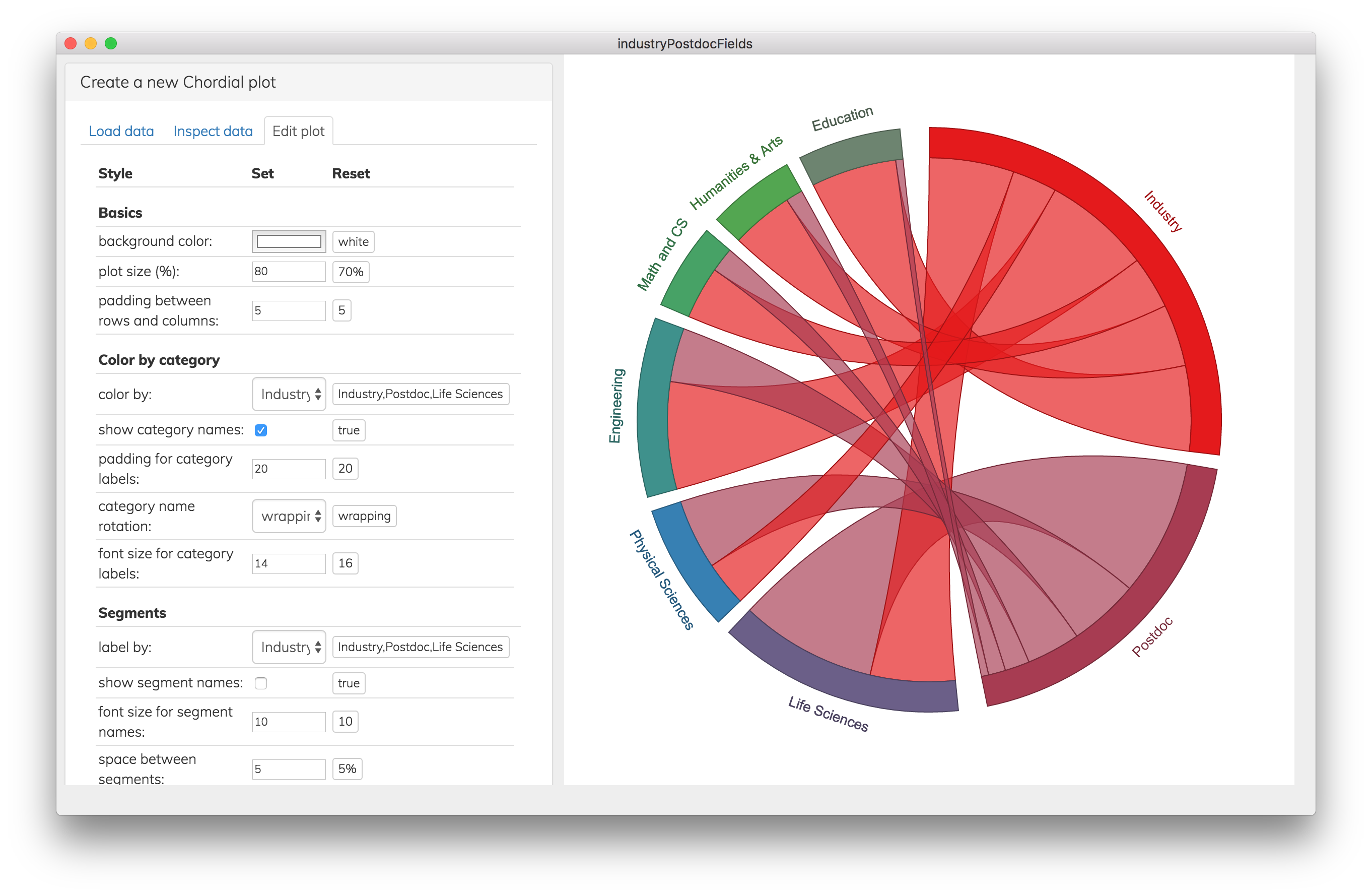
Convenient options for changing the plot's look
If you are a perfectionist, there are plenty of tweaks you can make, but the defaults also give you great-looking results with very little work.
Make a colorful masterpiece
With several built-in color schemes, easy color pickers, and a list of HEX codes to copy, paste, and edit, you can style this chart like an artist -- and bring just a bit of joy into the world of data.
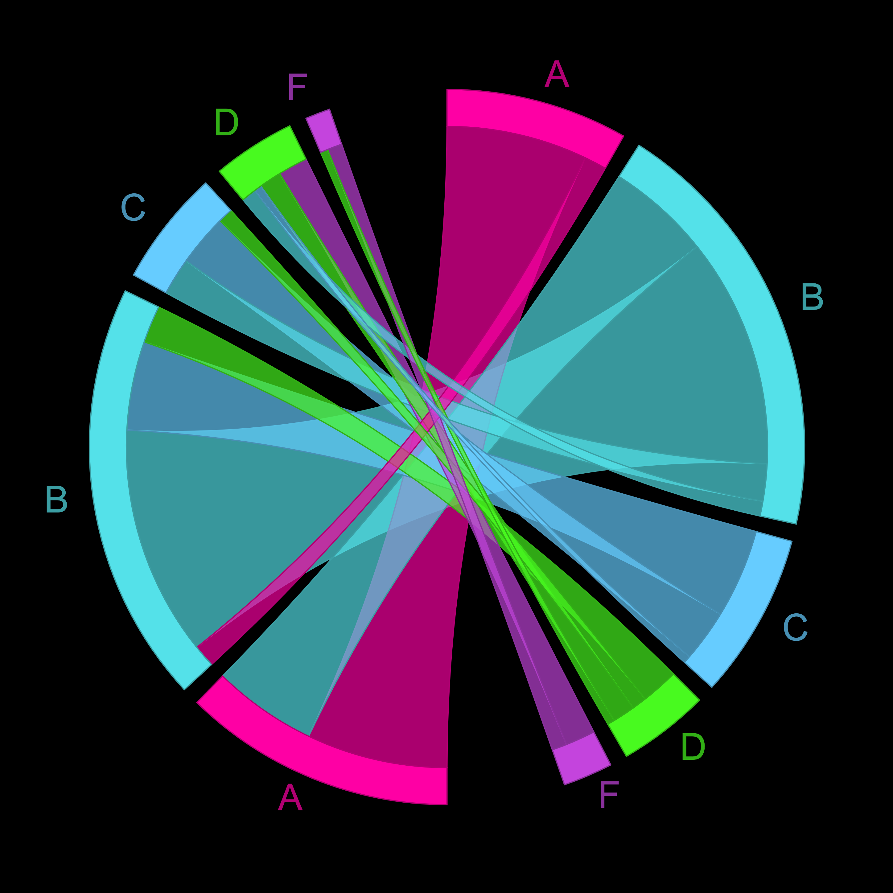
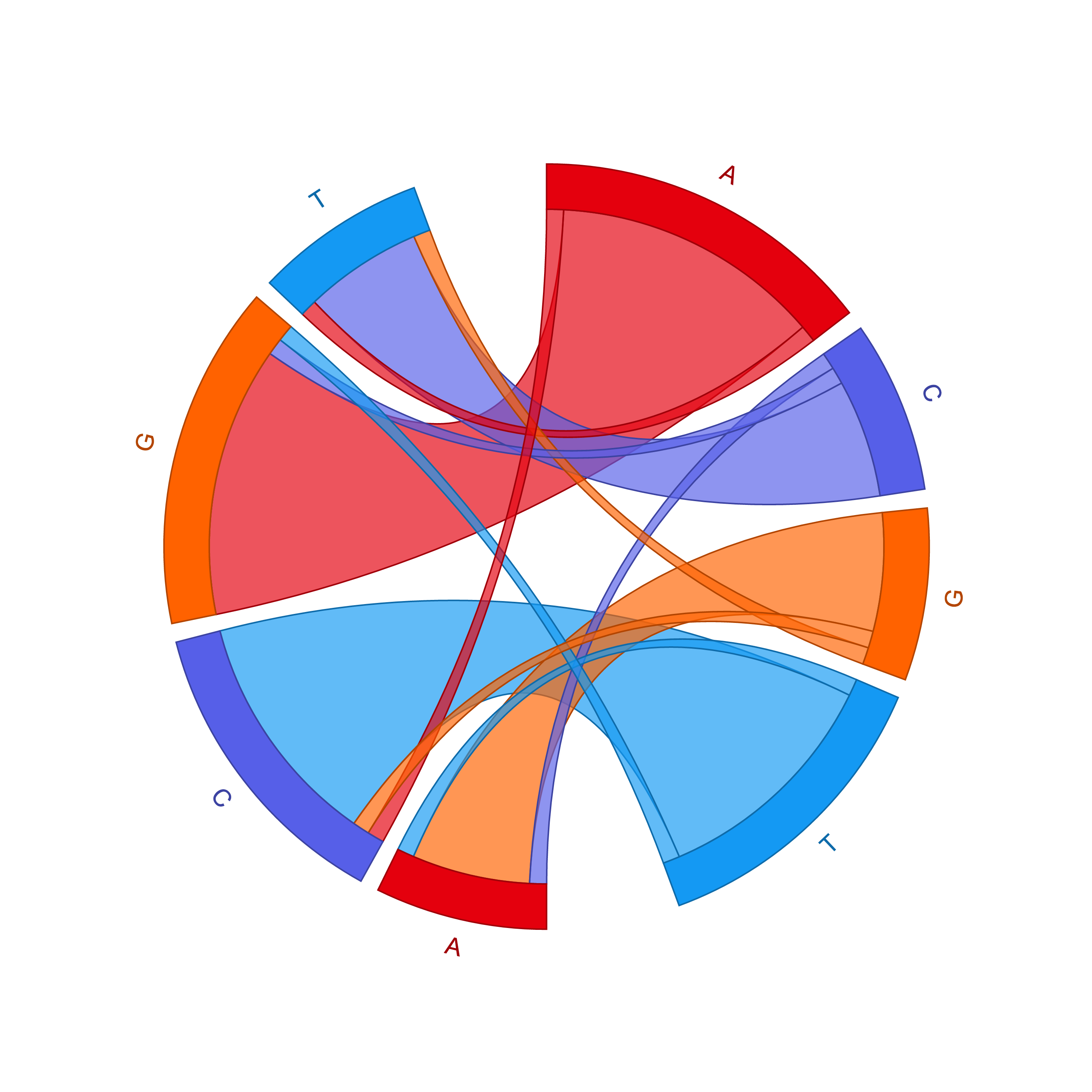
Examples
Chord diagrams are a great way to show connections, flow, and change.
Get some inspiration and see the variety of cool data visualizations you can create with Chordial.
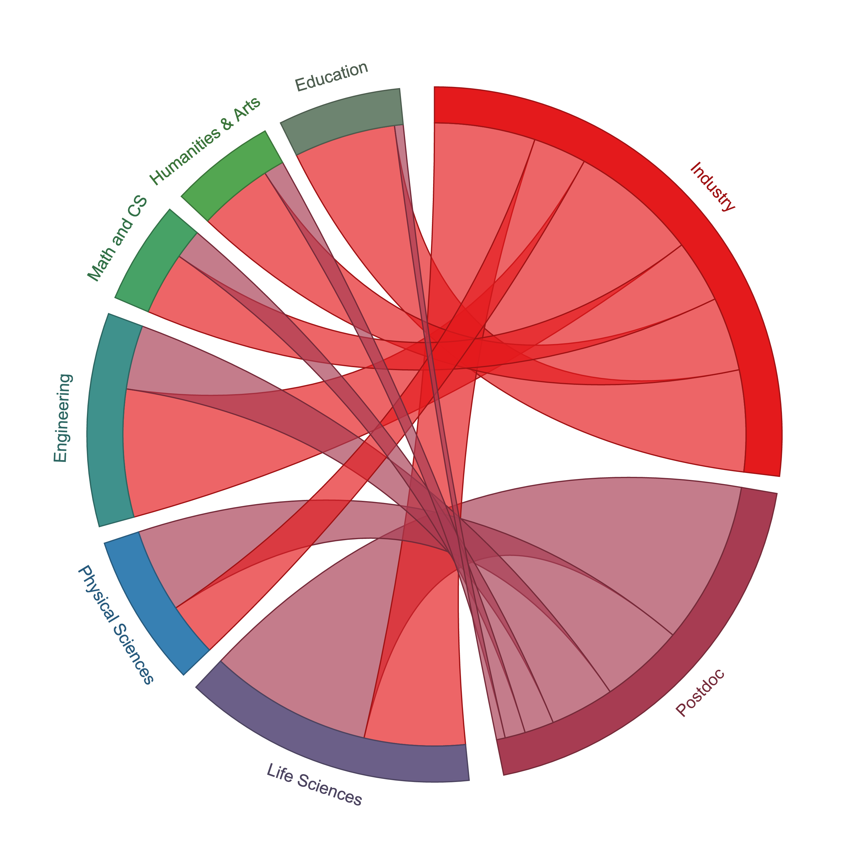
Any matrix can be captured in a chord diagram
Here is a matrix of school fields (rows) versus destination (columns) of either industry or academia. Each cell in the matrix is the intersection of one field with one destination, for instance, 2550 people in the life sciences chose to go into industry.
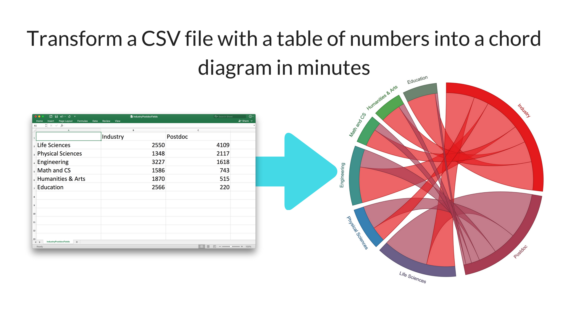
Step 1: Add your matrix
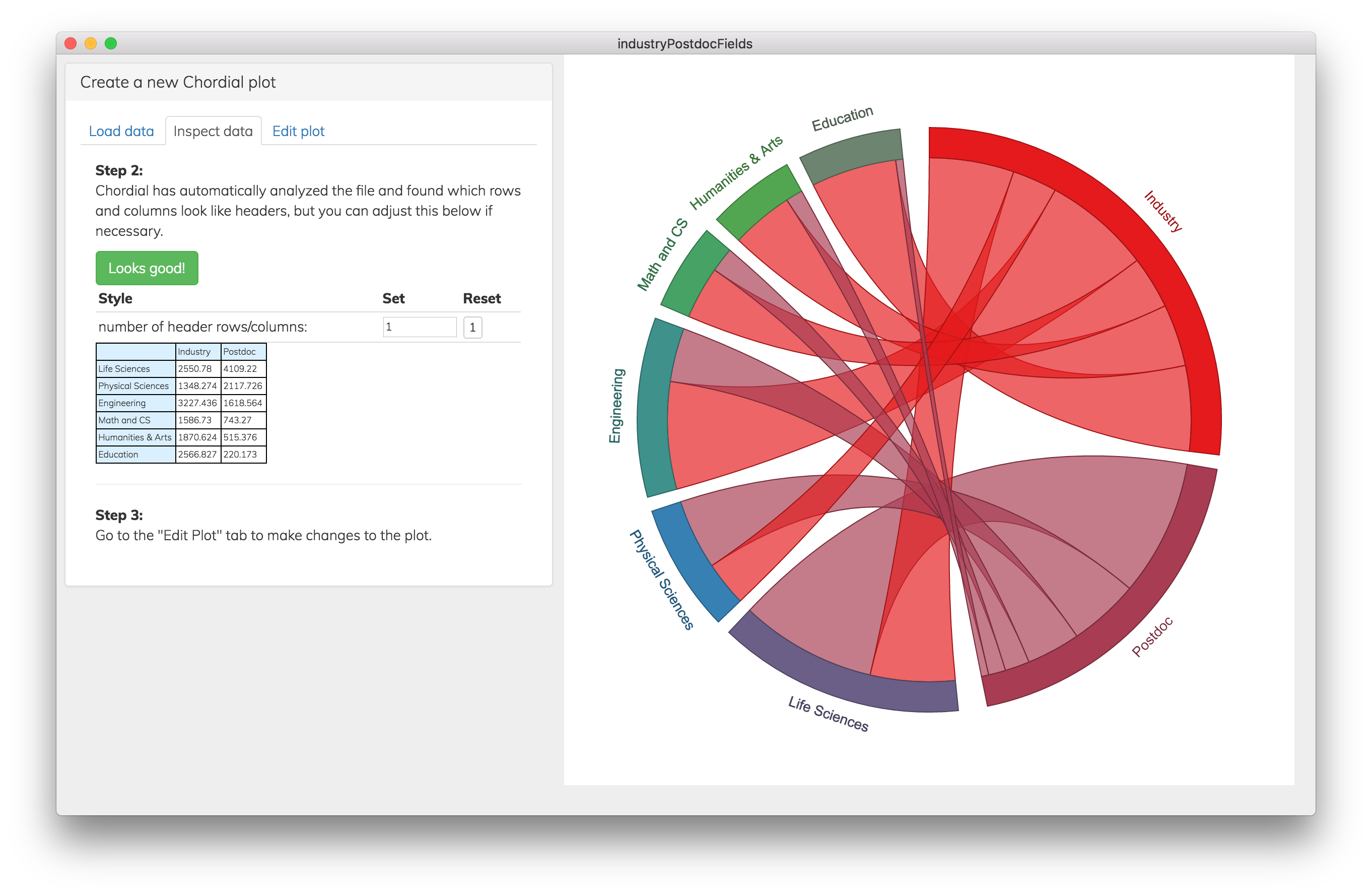
Step 2: Tweak your chord diagram with dozens of styling options
And done!
Export as a high-resolution PNG image.
Export as SVG for publication-quality vector art that you can edit in Illustrator or Inkscape.